Flower Shop Brand – Flower arrangement + Cafe
April Garden is a new brand creation project for an online flower shop and a cafe based in Shanghai. Founded by 2 professional office ladies who shared a common passion for flower arrangement and love for arts.
April Garden position itself as a community builder for flower lovers and to promote flower arrangement as a leisure culture and relaxing lifestyle.
April Garden not only want to build an online flower shop business, but also build a gathering space and community for flower arrangement activities over a cup of coffee and cake, while connect and learn a few new things with like-minded friends.
Creative Mood Boards
The creative process of April Garden branding design begins with exploration in the tonality and expression of the brand. 5 mood boards were created to demonstrate the different possibility of a flower shop + cafe tonalities. Leverage the analogue of different timing in a day and the mood and emotion of a lady, the mood boards facilitate the discussion of the brand position and look & feels that best resonate with the founder’s vision and target consumer group.
Multiple Meanings Visual Identity
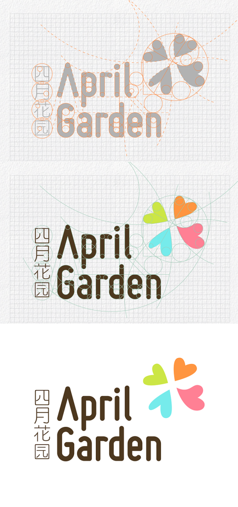
With a couple rounds of design explorations and refinements, the final brand identity design consists of 4 pieces of hearts that form an abstract form of “花” – Chinese character of “flower”, an English brand name and a Chinese name.
The 4 hearts brand visual identity also embedded multiple layers of meanings and application flexibility.
- Represent the core flower shop business and flower arrangement arts
- Connote the sense of community that April Garden intends to build, by pulling people together who share the love for flower and leisure lifestyle
- 4 pieces of the heart also represent the four seasons and echo the April naming
- The visual icon could also be used as coffee stencil pattern, as well as branding monogram etc
- Use of 4 colours represents various consumers of different backgrounds yet with love in colours and arts
Robust Logotype design with both English and Chinese names
The brand name typography is constructed carefully in San style to reflect the young and contemporary brand position, plus the rounded stroke and slight geometric structures at turning angles, provide April Garden a balanced look that appeals to both genders with an artistic and airy feel.
To reinforce the Chinese presence, simple Chinese typography is also developed to match the holistic feel of the English typography and brand visual identity.
Design flexibility for various applications
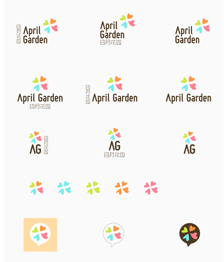
As part of new brand creation, a collection of brand variants are also explored consider the wide possibility of applications online, offline, social media, and physical application and brand expressions.


